Sorry about the blog delay.
Christmas and New Year’s fell at an awkward time of the week, that’s my excuse anyway.
Unfortunately, I haven’t got nearly as much done as I’d like since last posting.
It’s a little dispiriting to think that the short video I made of the character walking around the school was 5 months ago now.
*sigh*
On the face of it, things don’t look massively different since that video, besides decor.
I’ve spent most of my time creating editors and panels and whatnot to assist design, instead of, well, designing.
It’s maddening to think I’ve been working 9 months or so on this now, and I’ve still not gotten round to some of the most basic aspects of the game engine.
I think that's just the nature of the beast though. When a custom game editor is involved, the engine seems secondary.
I hope the work I've done up until now pays off. The whole point of creating a game editor is to speed up game-development, but in my case I may have miscalculated the need for such tools. After all I was able to create Wasted Youth, Part 1 with nothing of the sort, and by this point I was nearly half way complete.
Time will tell.
So you might be wondering what the title of this blog is referring to?
Since the last post the graphical style of the game has taken shape significantly in my mind. Partly motivated by a phrase that’s floating about in my mind recently - ‘uncanny valley’.
Incase you don't know what I mean by this, here's the description provided by google:
Uncanny Valley - Used in reference to the phenomenon whereby a computer-generated figure or humanoid robot bearing a near-identical resemblance to a human being arouses a sense of unease or revulsion in the person viewing it.
Now, unless the game I was designing was horror-based (which I suppose it is to some degree), this is not the desired effect when presented with a normal character.
I think my previous attempts at 3D character design have an element of this, so I’m inclined to try something different, to try and make them less person like and more cartoony.
I haven’t rejigged the old model yet but I’ve got a clearer idea of what I’m aiming for, and some very crude drawings in MS Paint that are too terrible for public eyes.
While I’ve never heard the phrase ‘uncanny valley’ to describe environments, I feel it can be applied in my case, particularly the outdoor area, so I’m trying out some new methods and styles to make it look a bit more to my liking.
That said, I’ve already designed a load of realistic looking objects and there’s the question of whether there will be a stylistic clash. Fortunately, I don’t think this is a problem, not to my mind anyway. I don’t want to cartoonify every single little detail, but just the fundamentals - floors and walls and such.
When I say cartoon/cartoonify by the way I don’t mean your standard cartoon effects like dark outlines and bright colours. Rather just a way of saying to simplify and generalize an object, instead of trying to mimic reality.
%20-%20MainBuilding_F1.unity%20-%20WastedYouth%20-%20PC%2C%20Mac%20%26%20Linux%20S.png)
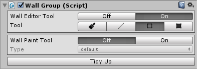
I like my panels
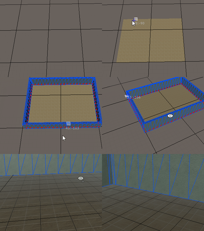
On a similar subject, in one of my previous blog posts (entitled Walls) I presented one of my editor tools. I spent some time creating it and testing it before deciding it was too complicated and unnecessary, vying instead to make all the floors and walls large hand-made 3D models.
In recent weeks, I realised I wasn’t keen on doing that, and because I wanted to try the simpler, tile-based approach I decided to give it another go.
Since then I’ve improved upon it and created several similar tools for floors and ceilings as well.
Now I can place walls, paint them, place doorways, windows, etc with a click of a button. Same with floors.
The intent behind this was not entirely for efficiency, but again, to reinforce some kind of logical style.
I’ve been playing about with them recently and while they don’t allow much finesse, they do add something of an old-school, acceptably simple feel that I like. And of course these tools allow for near instant level creation.
Now it’s just a matter of sticking with it and not changing my mind (again...)
rooom_ediotr1.0.0.0001.dll
Ultimately, the end-goal for my game editor is to resemble a personalized version of an RPG Maker, which is quite apt considering my first experience with game-design (and which no doubt influenced Wasted Youth, Part 1) was with RPG Maker 2000.
Unfortunately, it‘s taking a hell of a lot longer to get it to a place where I can actually use it.
And it doesn’t make for very exciting blogging either.
Compared to most free-roaming games, Wasted Youth takes place in a confined space, so the tool’s effectiveness as I explained earlier is questionable, but it gives me ideas for future projects.
Once I’ve built up a sizable 3D asset library, a game editor and engine, it only makes sense from my perspective to get my money’s worth, you know? (milk that $hit for all its worth!)
So that’s some of the stuff I’ve been up to lately.
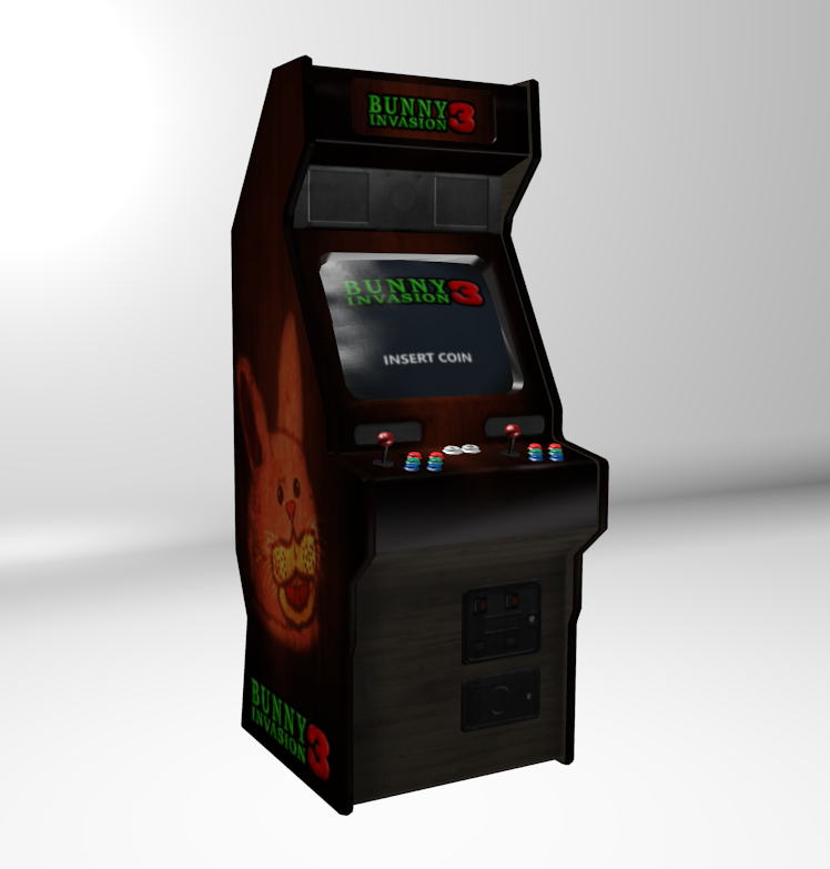
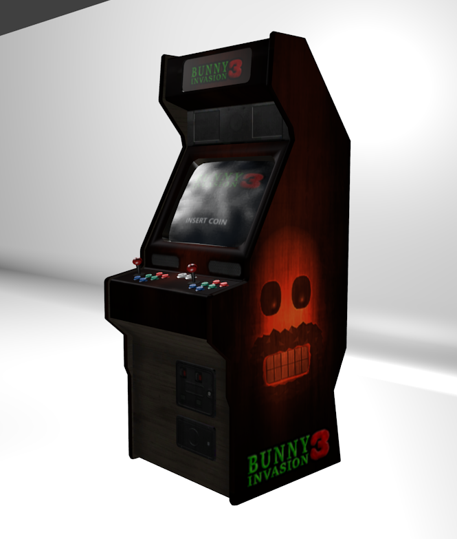
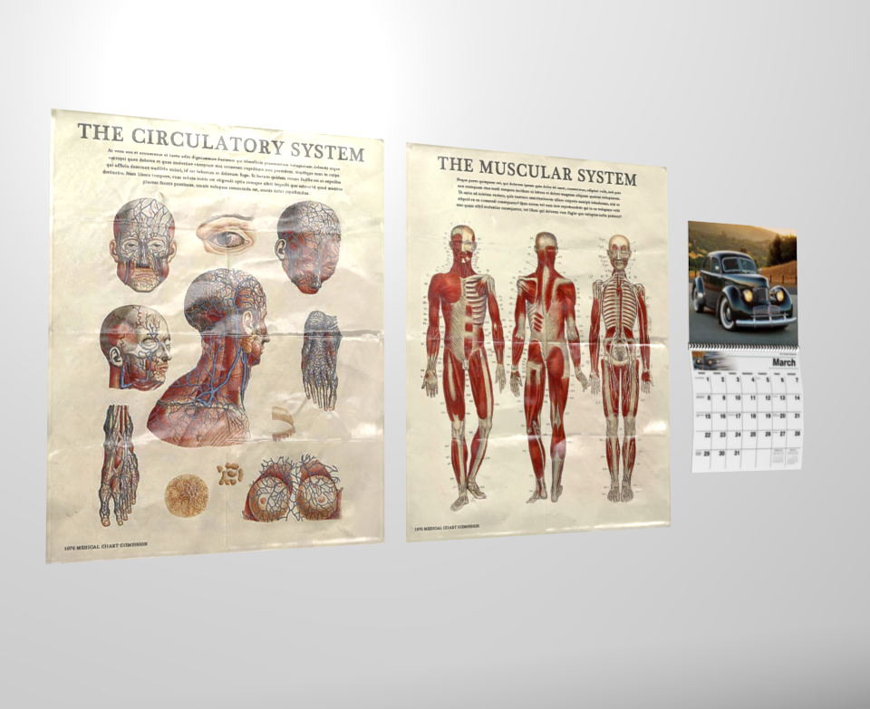
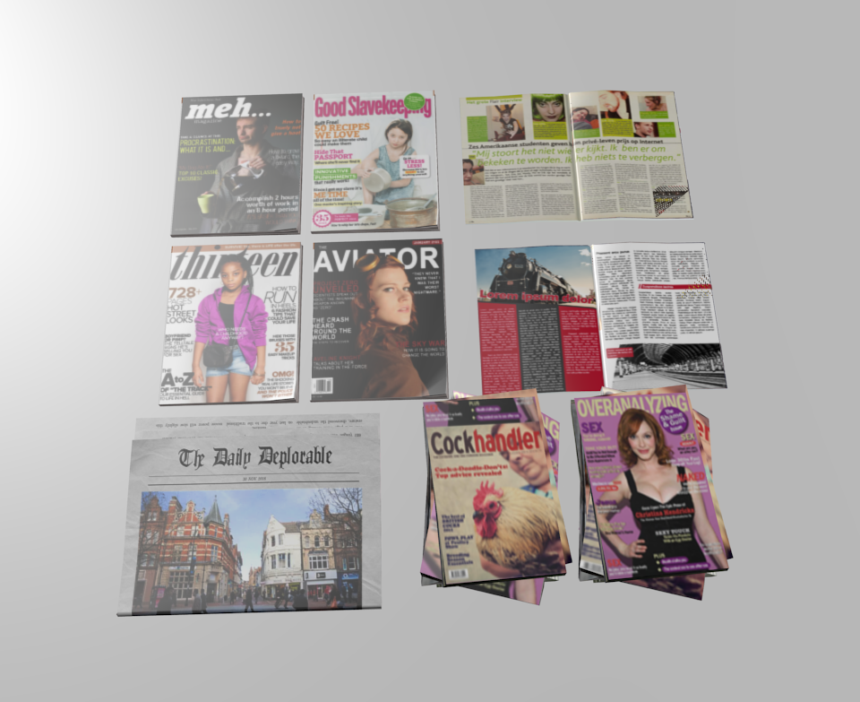
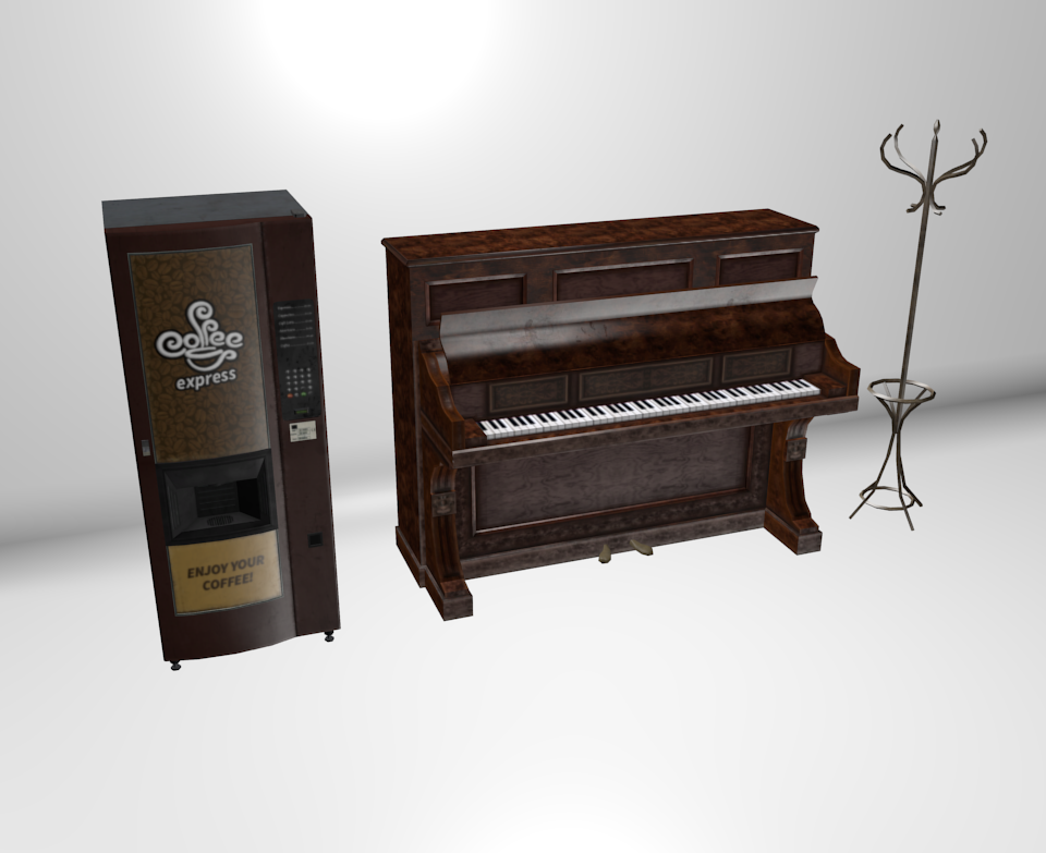
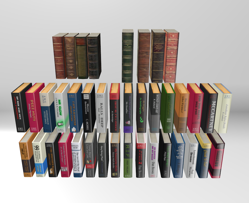
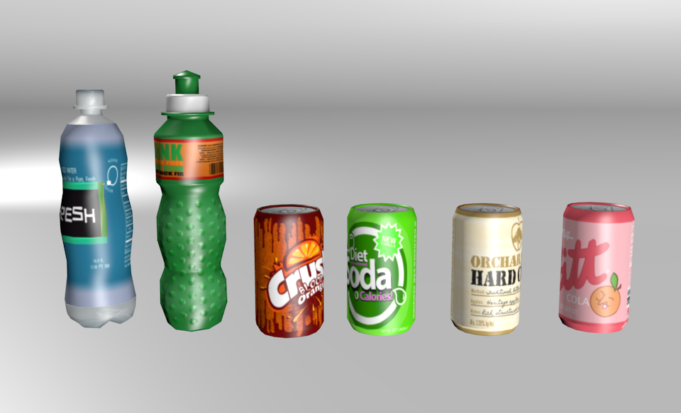
I haven’t posted many pictures recently so I’ll pad the rest of this out with some of my fancy game assets.
Besides the anatomy posters, there’s nothing here particularly school related. But somewhere, somehow, they all belong in Wasted Youth.
Just some random tat basically.
|
|
|
|
|
|
|
|
|
|
|
|
